I used the idea of the cable for the text but moved away from the telegraph pole, because it wasnt communicating the idea of freeness enough, so i thought of better ways to show this. As skype is aimed at a wide audience i thought i would use situations and images that relates to children teens and the older generation with the kite, plane and the old style telephone. These will be situated on buses and the tube as this is where the audience is most likely to be targeted.
I decided against the idea of not having an outline on the text because with this it makes it a lot easier to read!
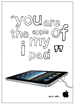
I am going to stick to the existing apple logo instead of changing it to the heart as i am not suppose to be changing the brands identity but just promoting it.
Because apple are fun yet professional looking i wanted a font that was going to communicate this... so tracing around the existing apple font made it quirky and more energetic, it added character to the text and made it appear more as speech. I have played around with various layouts below to communicate the message best.
I tested out the font i made for my valentines day cards to see how this would work on the poster, but it wasn't the correct style at all and totally confuses the message.
I tried to incorporate some hand rendered text with the apple font to make it more interesting and as if someone was speaking the words...
I began by using the apple font for a simplistic idea, but this just looked to boring and not like my style at all...